Featured Project
This is my featured project for Visual Communication class. I used this project as a featured project because I really like this project. I worked hard for this project and it turned out better than I expected.
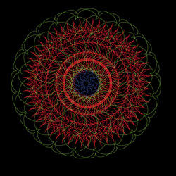
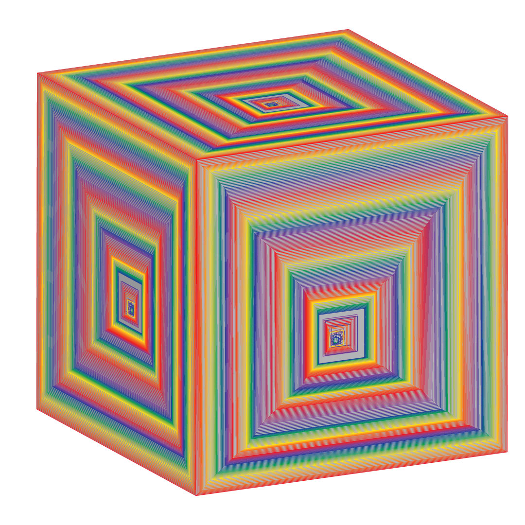
This is the radial balance with 3 concentric rings on it.
I created this because this kind of represents to my traditional styles. This kind of design is usually seen in Hindu traditional paintings and other stuffs.
I created this because this kind of represents to my traditional styles. This kind of design is usually seen in Hindu traditional paintings and other stuffs.
This is one of my BFTA group designs of radial balance.
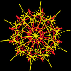
This is a radial balance design which I think resembles a kind of flame wheel. I like fire so I put it in my design.
This is a radial balance design which I think resembles a kind of flame wheel. I like fire so I put it in my design.
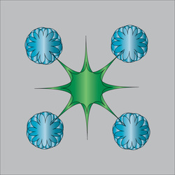
In this picture, I am trying to make a flower with radial balance.
This is a type of a blend/repition. In this design i am trying to make a human form but then i have just let the shapes free without making it like a human.
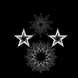
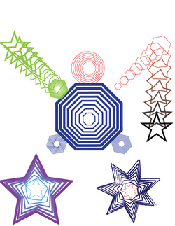
This is one of the RFTA group designs(symmetrical) in which i have used mostly stars to make my designs.
This design i created with my partner Eric which has a symmetrical balance.
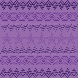
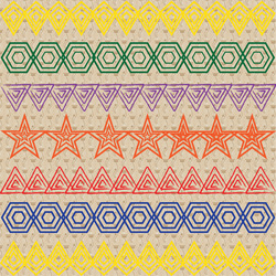
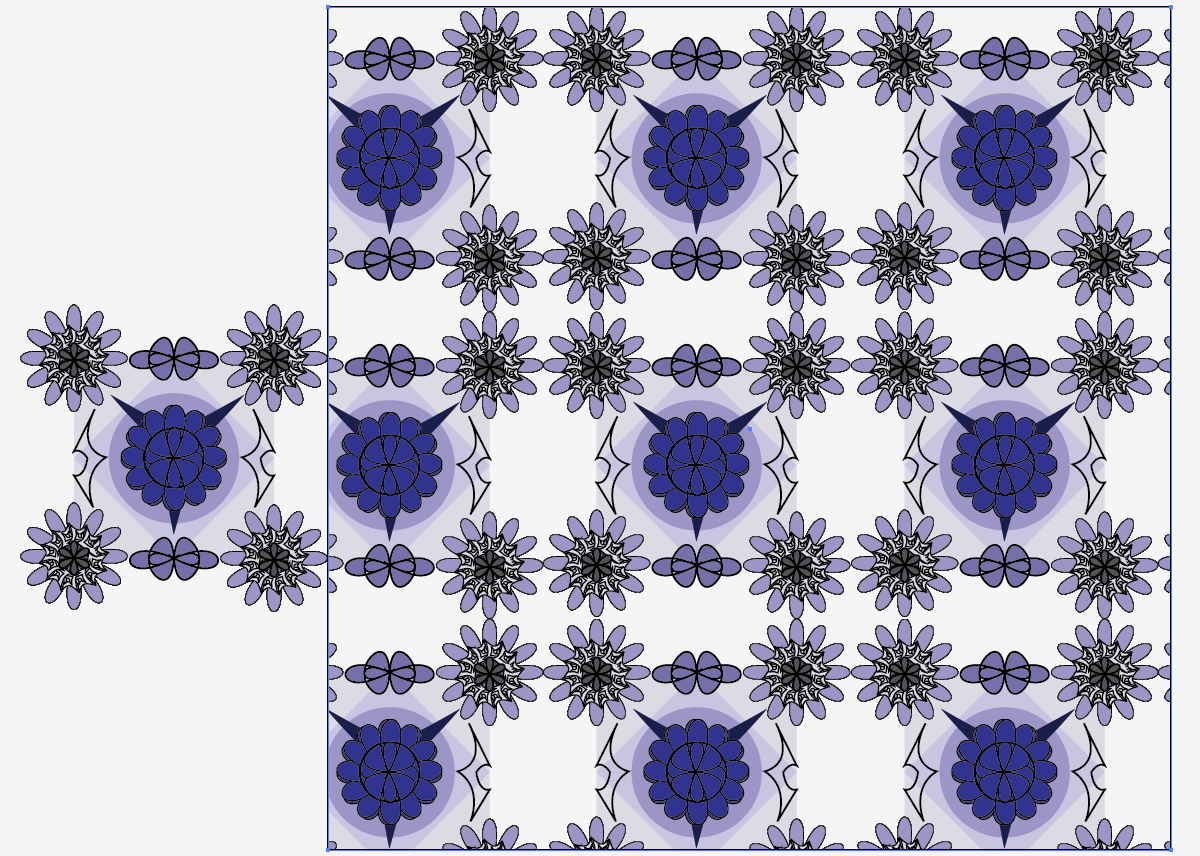
This is the design I created for quilt/blanket designs.
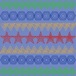
This is the monochromatic version of my quilt design in which blue is my base color.
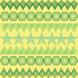
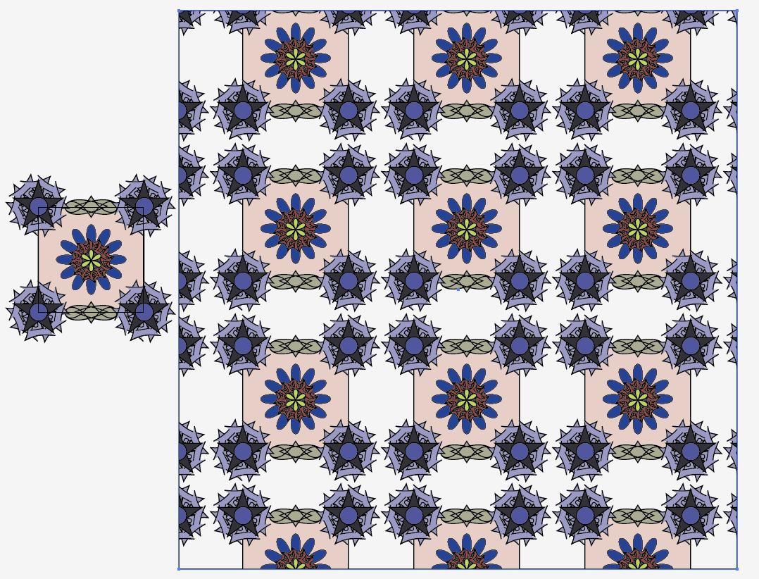
This is the Analagous version of my quilt design in which green and yellow are my base colors.
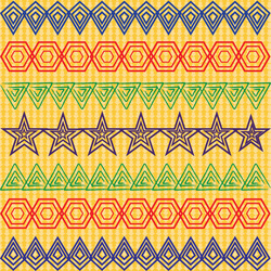
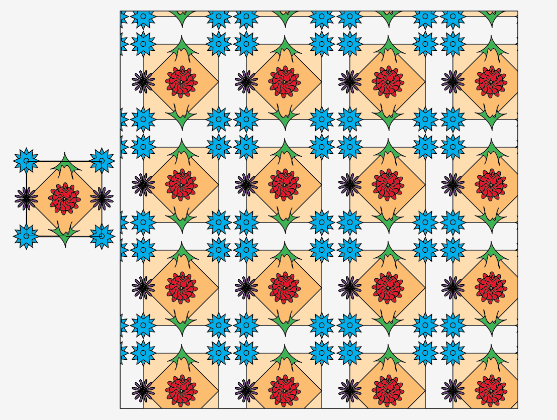
This is the tetriad color i chose in which i have selected the primary colors: red, blue and yellow.
I chose the textures from 'classic decorative' selection. I chose this texture because it makes the patterns distinctive and it maintains the contrasts and gives the design a better finish.
This is my own choice for the colors and the textures. Again, i chose to use the primary and secondary colors in the shapes. The texture is from the 'nature' selections which i think suits the design.
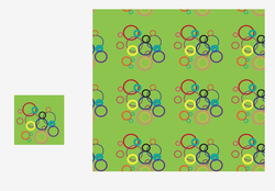
This is my pattern design in which i have used circles of different size and thickness and also color. I have tried to create a 'bubbles' sort of pattern.
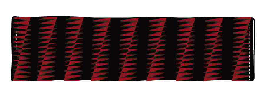
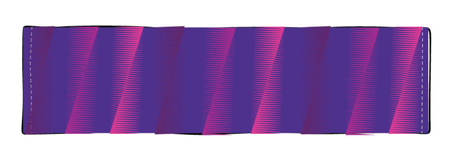
In this pattern design, I have used straight lines of different thickness and colors and tried to make pattern for clothes and other textile products.
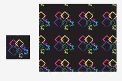
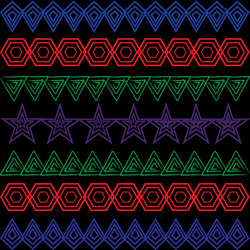
In this pattern i have used black background because i think it gives more details and contrast to the shapes. I have used diamonds and stars for the shapes and used a different style for my outline. So, it is like a design created on a blackboard with colorful chalks.
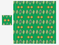
This is my partner pattern design. I worked with Teresa and came up with this design. I have used triangles and diamonds in this pattern.
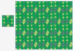
Partner Pattern design #2. In this design, we have removed the diamonds and moved the triangles instead.
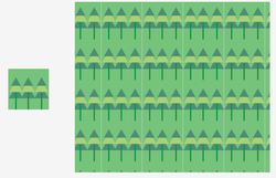
Partner Pattern design #3. In this design, we used the triangles from the previous design and moved them to create a pattern of pine trees.
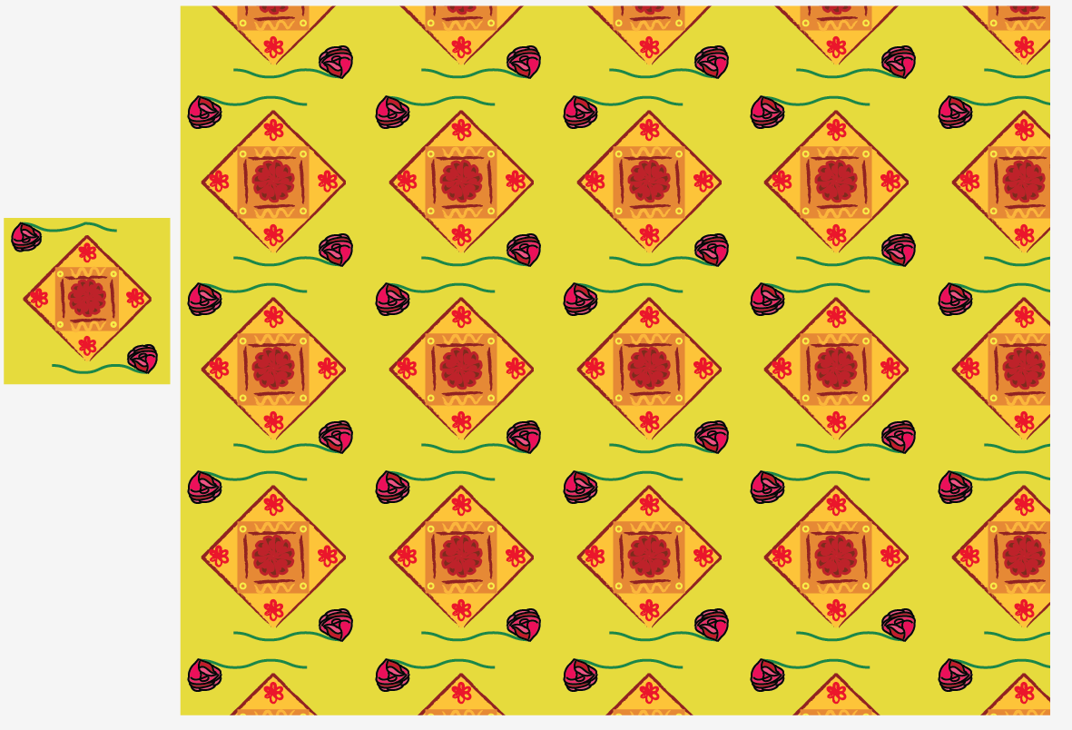
This is the pattern I created with my partner Teresa. We were asked to design a pattern for a Mexican wallpaper and we came up with this in which we have used some warm colors and flowers.
This is the kleenex box design I created with my partner Teresa.We combined various colors to come up with a rainbow design.
This is my first testallations pattern in which i have used the monochromatic colors in my shapes.
This is my testallations pattern #2 in which is similar to my first one. In this pattern, i have used my own colors.
This is my tetallations pattern #3 in which i have used the triad colors.
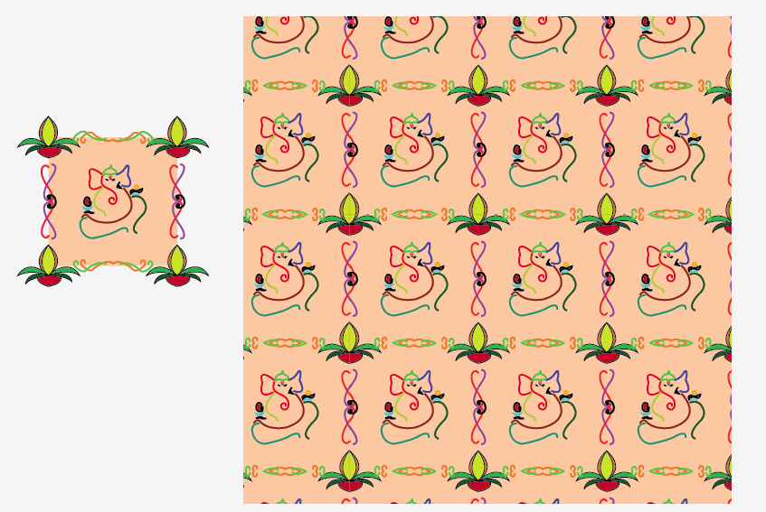
This is my testallations 2 pattern in which i made using only pen tool. I used Ganesh at the center as my unique design.
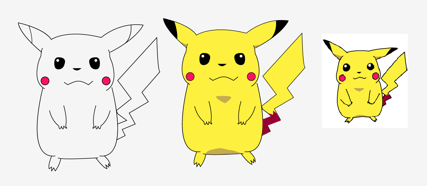
I made a Pikachu in Illustrator with the pen tool on Adobe Illustrator.
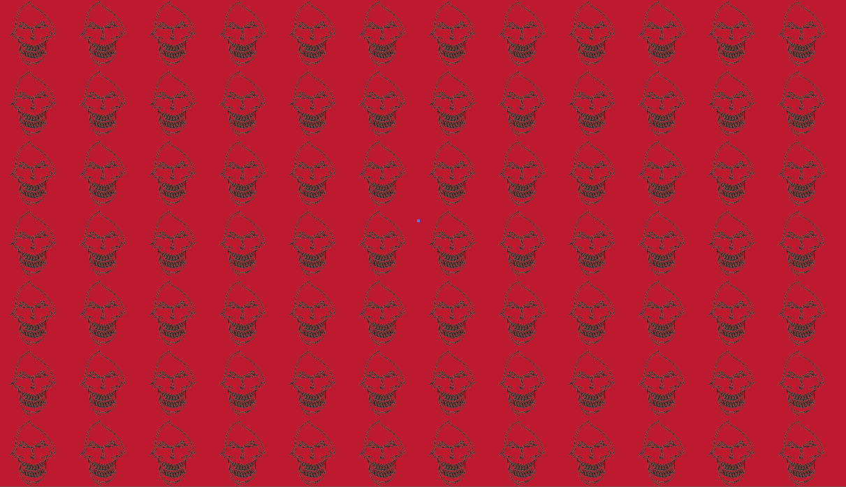
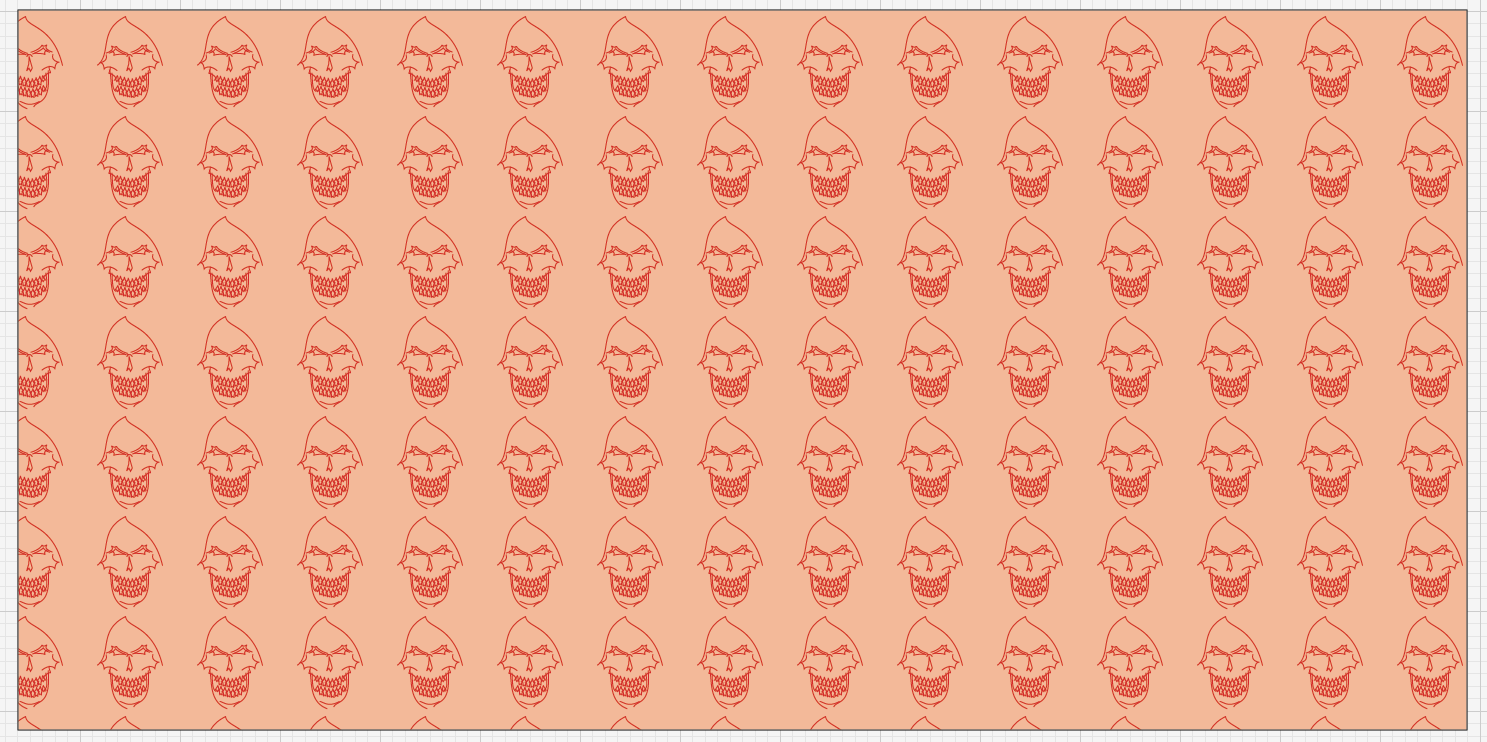
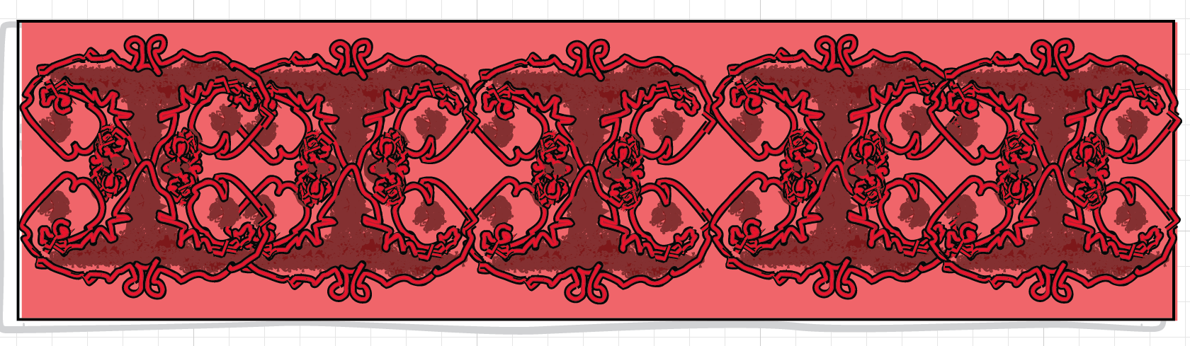
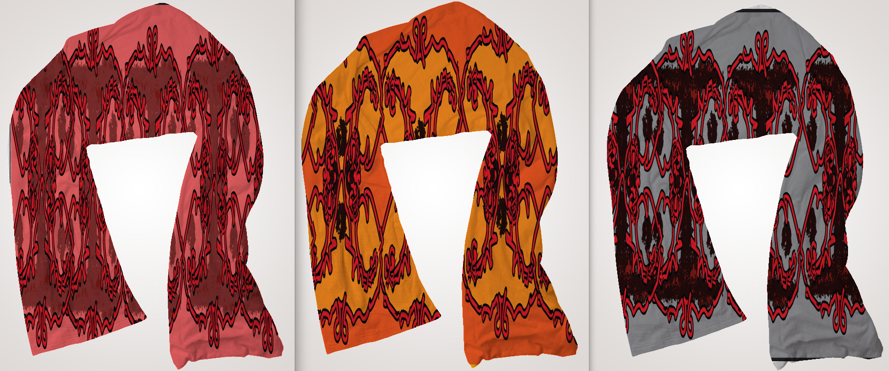
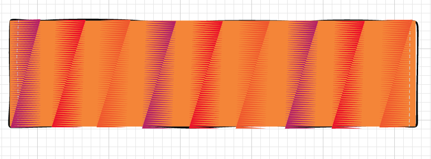
This is the pattern for the 'threadless pattern' group project. I named this pattern 'Hot Head' because there is skull and the background is red. Our challenge was to create a pattern for a scarf.
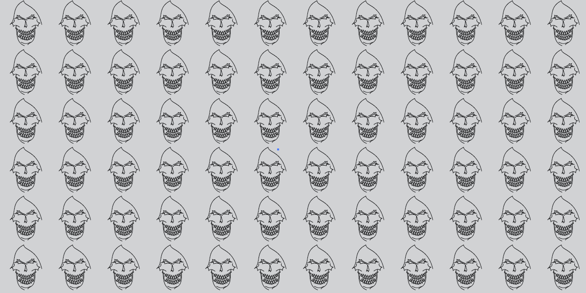
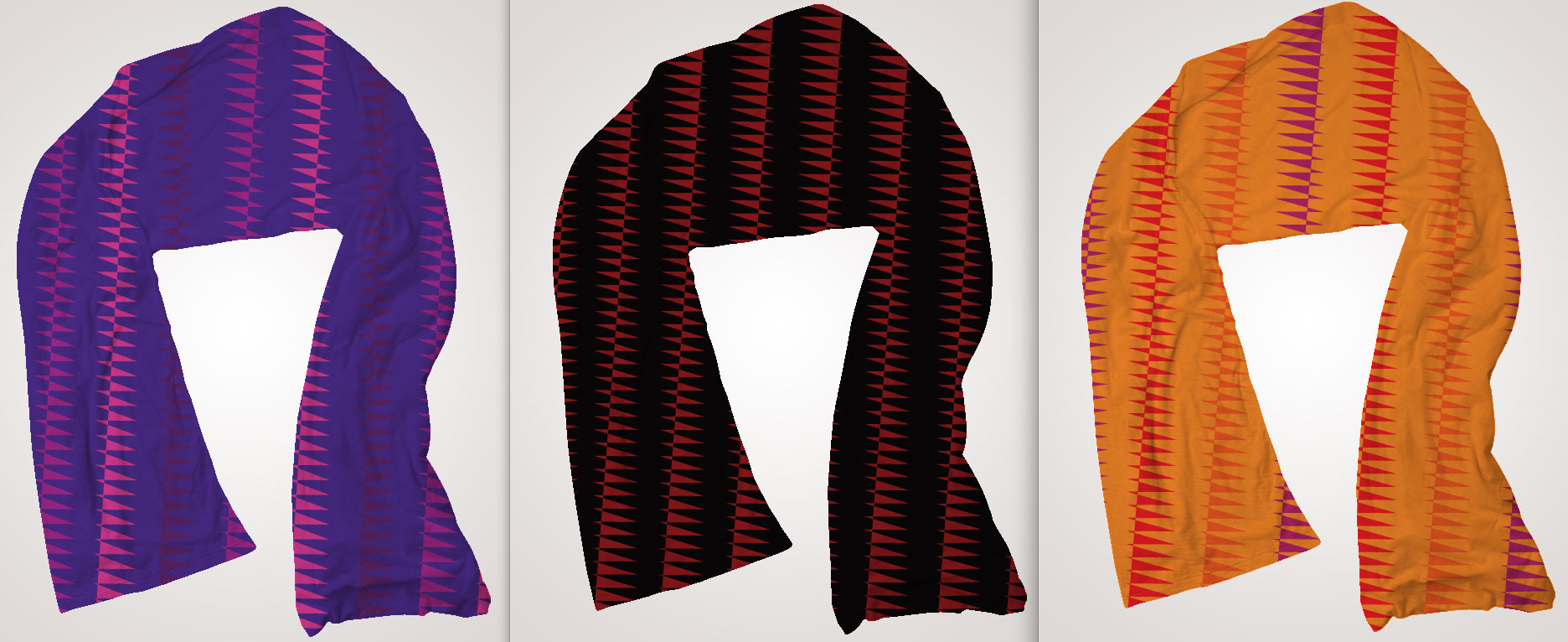
This is the monochromatic version for the Threadless group pattern challenge.
This is the analogous version of the Threadless pattern challenge.
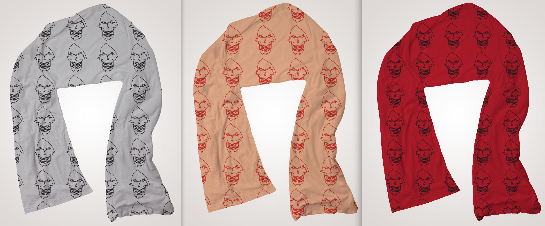
Here are all my patterns on the product, i.e on a scarf.
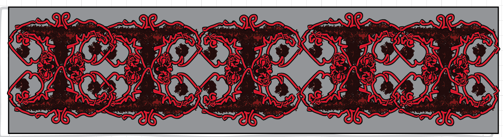
This is the pattern for the Threadless pattern challenge designed by my group member Marcos Abina.
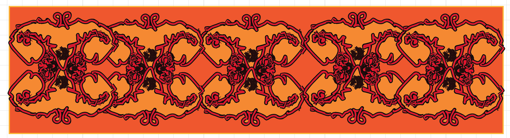
This is the analogous version of the above pattern by Marcos.
This is the monochromatic version of the pattern created by Marcos.
These are all the patterns by Marcos on the products.
This is the pattern designed by my another group member Damion Vacca-Davis for the Threadless pattern challenge.
This is the monochromatic version of Damion's design for the Threadless pattern challenge.
This is the analogous version of Damion's design for the Threadless pattern challenge.
These are Damion's designs on the product, i.e scarf for the Threadless pattern challenge.
| threadless_presentation.pptx |
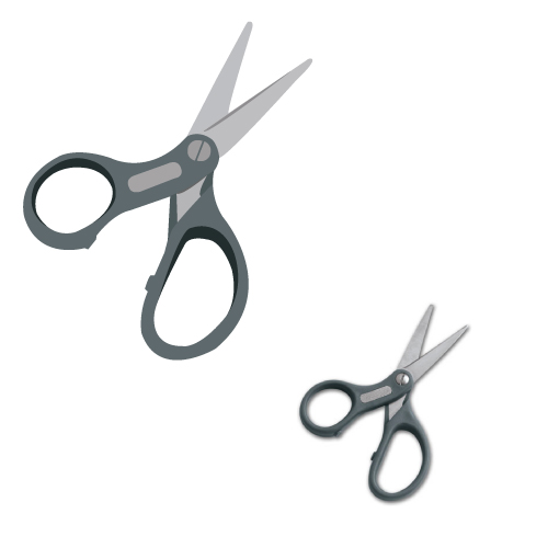
This was one of my pen tool assignment in which my teacher, Mr. Means asked the class to trace the picture of the scissor using only the pen tool. It was one of our pen tool warm up assignment for the upcoming digital portrait project.
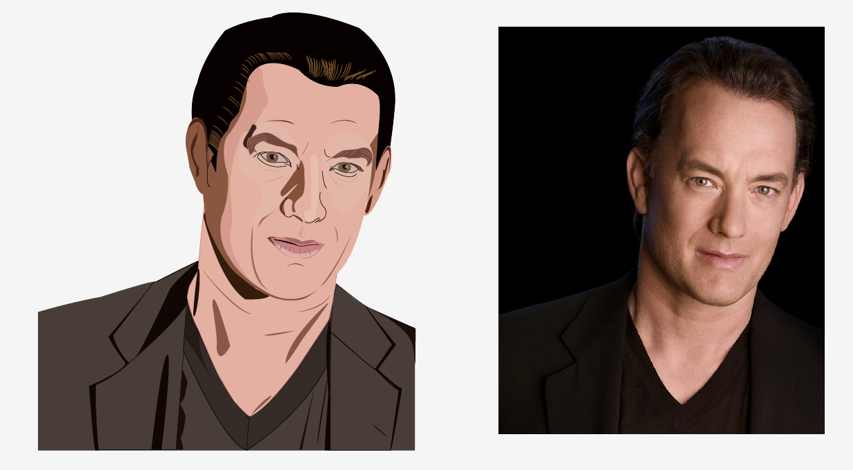
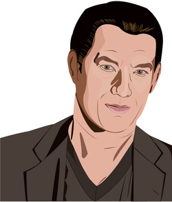
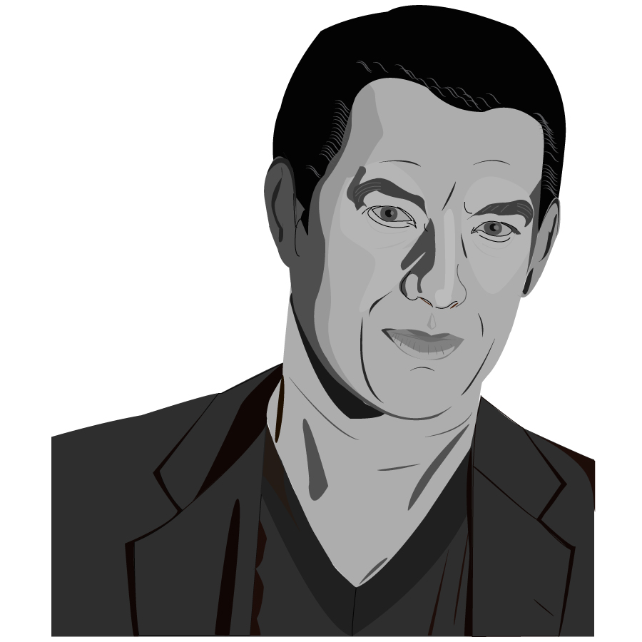
This is my pen tool portrait project in which we had to trace out a picture of any person we want using the pen tool and only pen tool. There was some exceptions with the hair. I used Tom Hank's Picture and it turned out really well (better than I expected). The people who looked at my work could tell who it was. I used different layers to create the midtones, highlights and the shadows. The colors look good and I am happy with my work.
This is the monochromatic version of the original illustration.
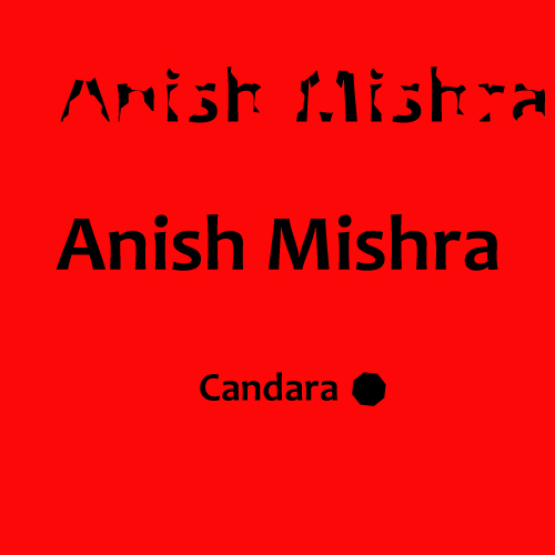
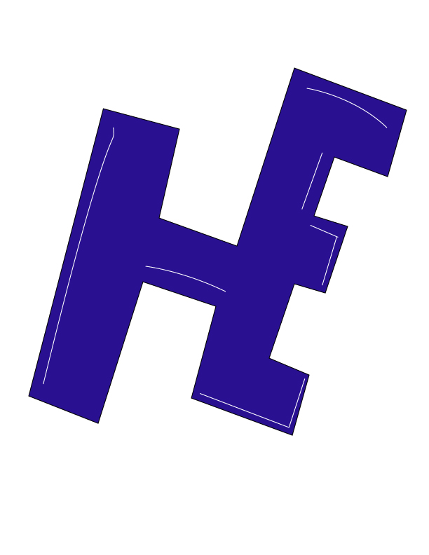
This was one of my font assignment, in which we had to use a shape to subtract shapes from an actual font and try to make a new font.
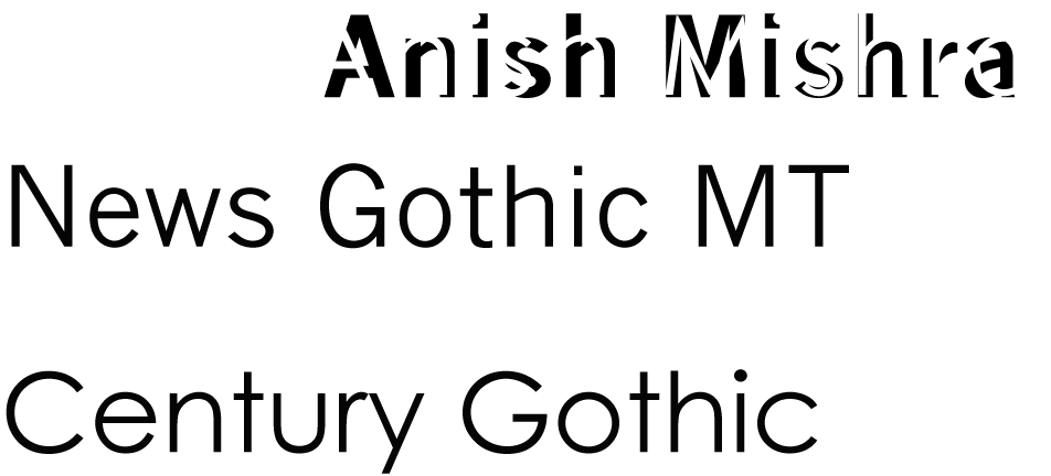
This was also one of my font assignment, in which we had to use two different fonts and combine them to make a new font.
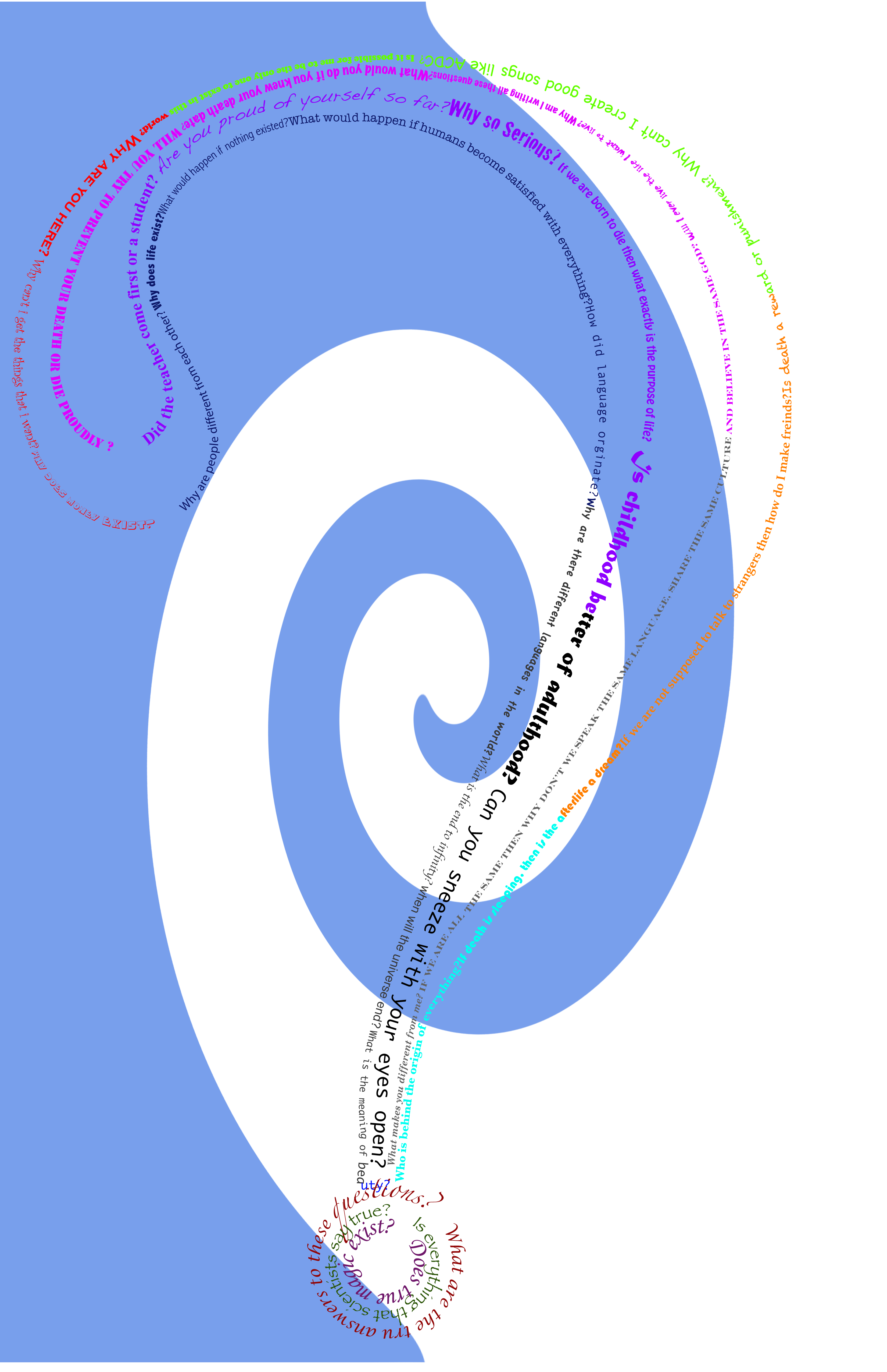
This is the project 'path of question' for my Visual Communication class. We had to form a question mark with different questions with different fonts, size or colors. We also had to design the background for it.
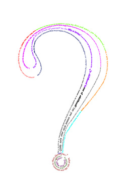
This is the version of 'path of question' without the background.
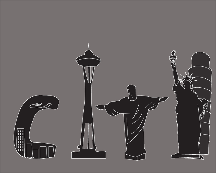
This is my 'visual onomatopoeia' project in which I chose the word 'city'. I used some of the renowned architectures in the world to create some of the letters in the word city. But there are some mistakes in the picture. The space needle has some uneven lines and also the letter 'c' has some mistakes like the buildings in in are not in place and only one of them has windows. The reason there are lots of mistakes is because I ran out of time. I had thought of doing another word but it didn't turn out like I wanted so I changed the word to 'city'. The word was more difficult than I thought but the final product was satisfying. I am really happy how the Christ and Statue of Liberty came out.
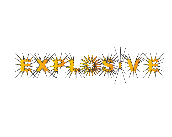
This is also the part of my visual onomatopeia project. We had to do one individual and one with a partner. For our partner design, we had to choose the word from a limited list of words and ours was 'explosive'. The word was difficult to express. But me and my partner came up with the idea of expanding the anchor points which made it look like it was 'exploding'. To give it more effects, we colored it with the gradient of some orange and yellow to look like fire.
In this project, we had to create a logo for an enterprise of one of our teacher. The name of the enterprise is Harmon Enterprises. We interviewed him and went through his likes and dislikes and some ideas and visions and came up with this final result. This was a group project in which each group member had to come up with one idea and my group members made the capitol building and the badge. I did the suit with a curve which looks like it is holding the building. It came out pretty good.
This is my individual design for the Harmon Enterprises logo project. I thought of a suit holding a building and came up with this. I think the suit and tie denotes gentlemen or perfectionists.
This is the wordmark for Harmon Enterprises. It was also the part of the logo project.
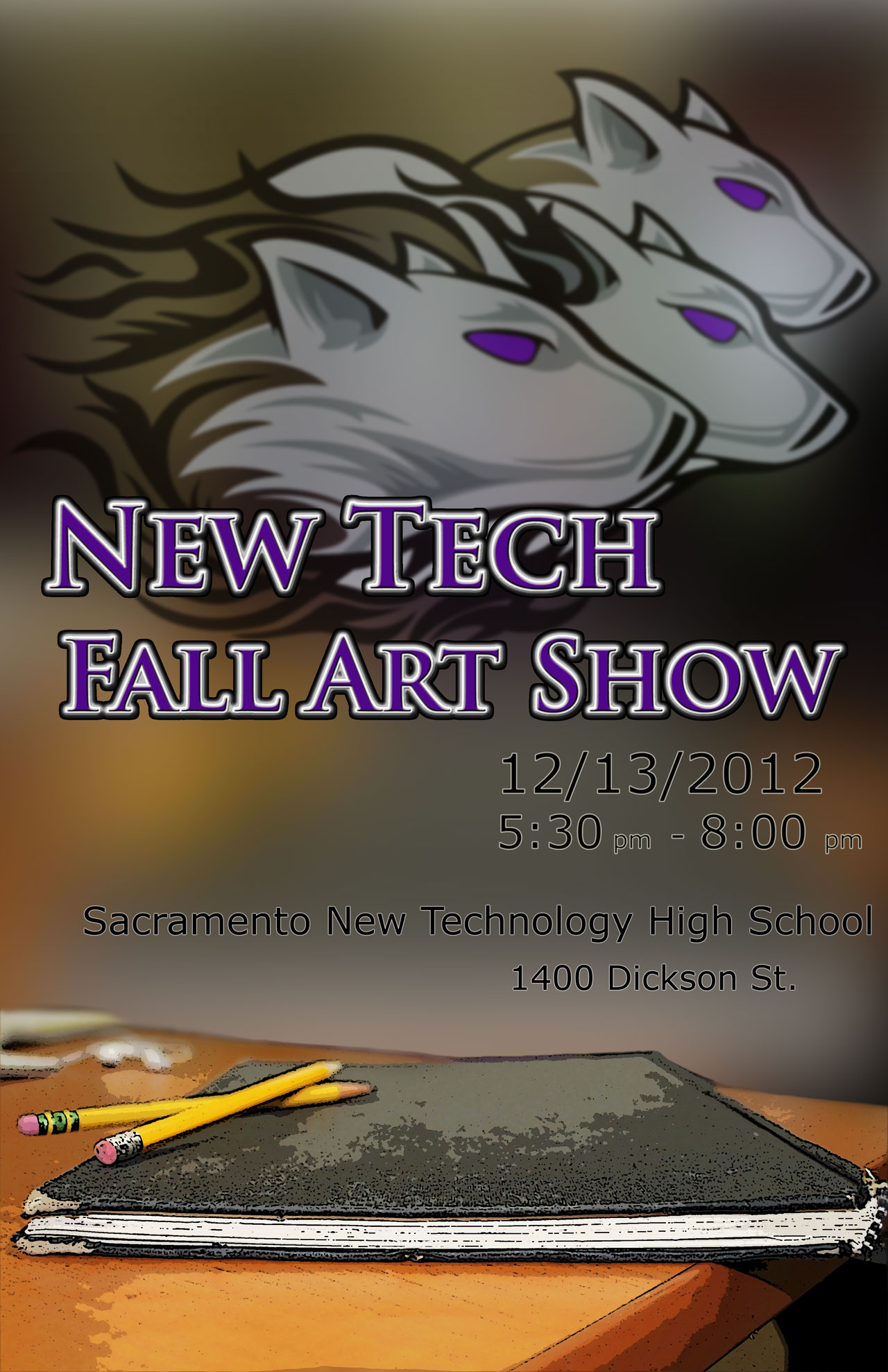
This is the poster I designed for the Art Show in our school. It was one of our project. It had to be 100% original, so I took the picture of one of my classmate's sketch book with two pencils on my computer table in class and used Adobe Photoshop to apply some effects. I blurred the background and put the Timberwolves int he background as a school symbol. I did all this in one single class and I think it came out better than I expected.
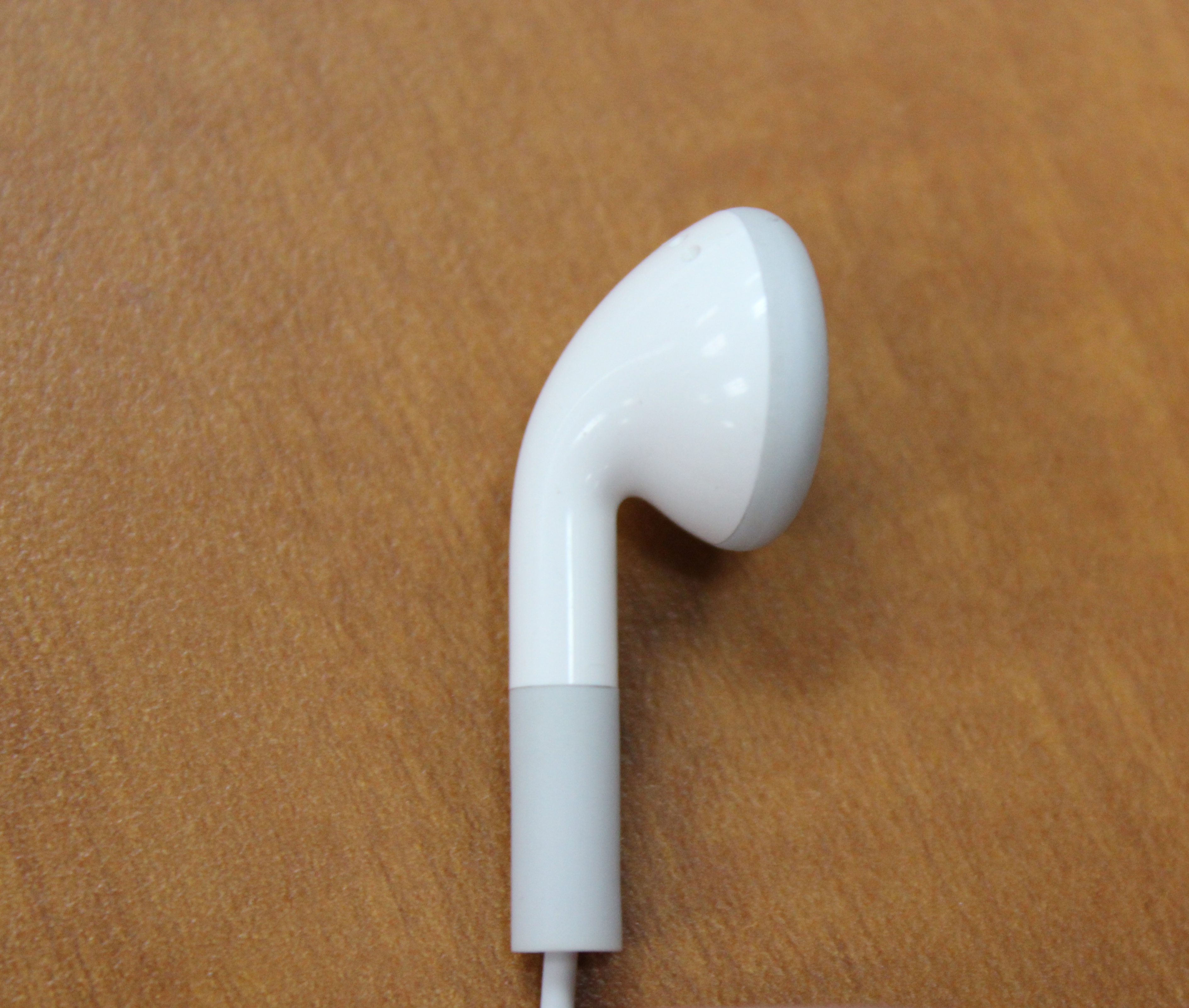
This was one of the assignment for the art show. All the students had to take pictures of any object that looks like an english alphabet. I had my headphones on and I thought it looked like the letter 'P' so I took the picture of my headphone and used it as the letter 'P'.
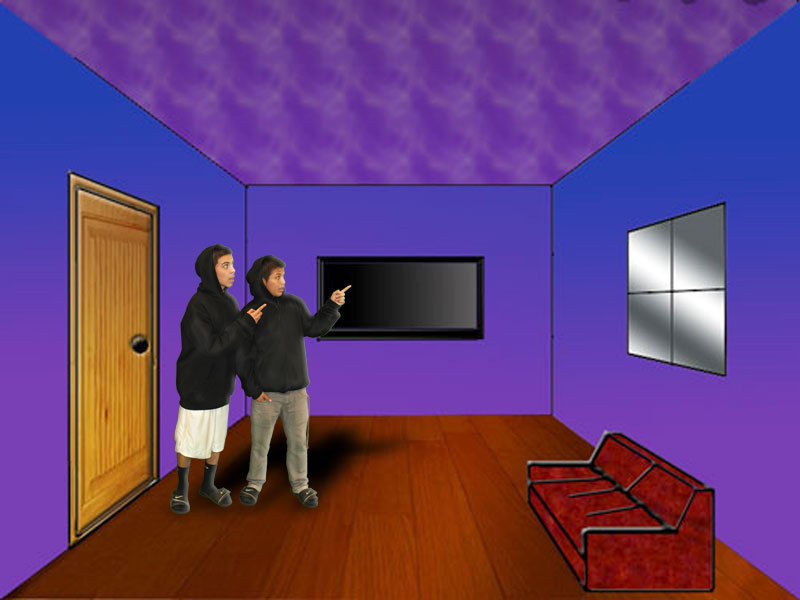
This was one of our assignment for the art show, in which we had to replace the background of a picture. I asked my friends to pose for a picture and then edited the background and put them in the virtual room, which I had created in another class.
My Art Statement.
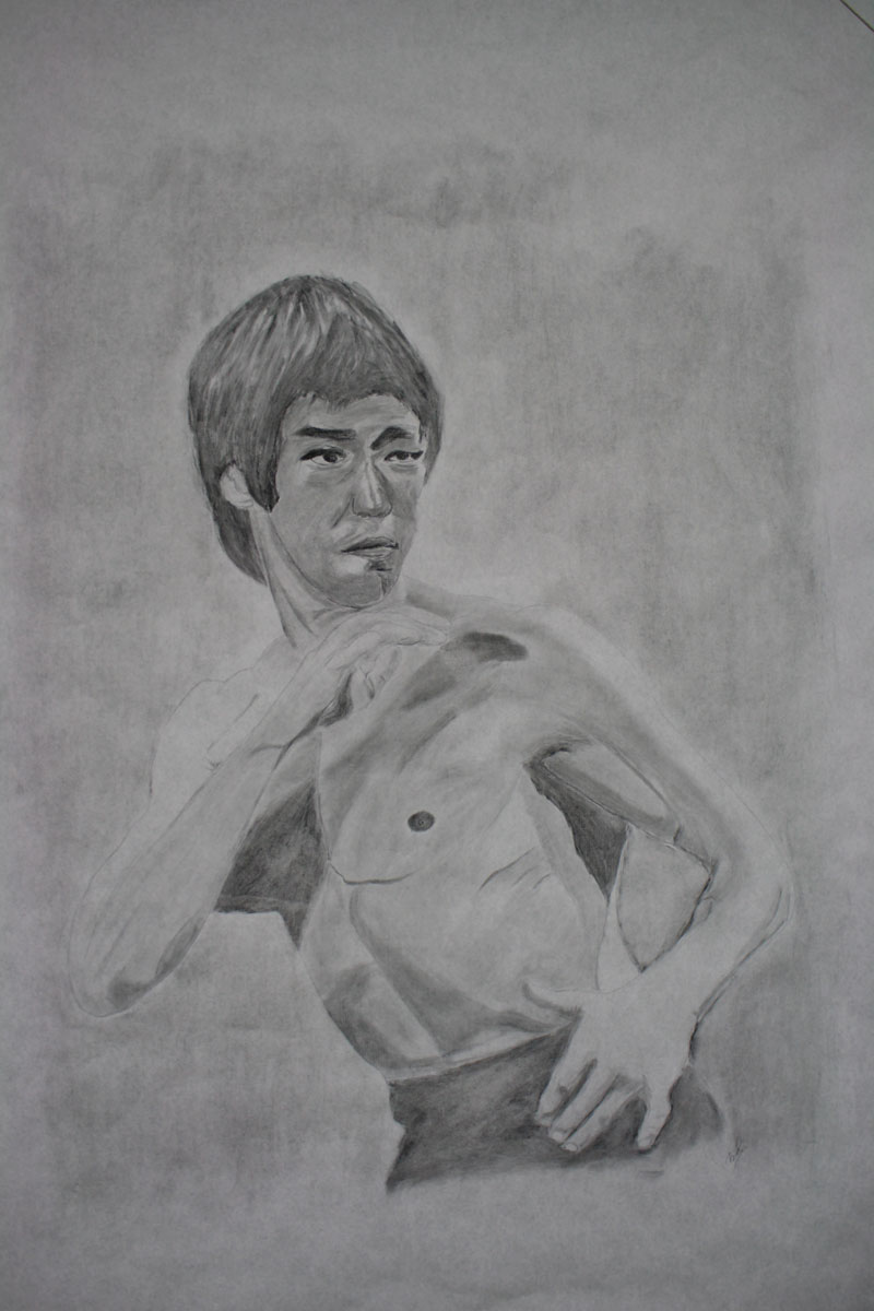
This was my art show project in which I made a portrait of bruce lee. I made it with the help of a transparency to make the outline. I really liked it because, it turned out really well. I was appreciated by my teachers and friends for the work and i really liked it.
Final Assignment 1
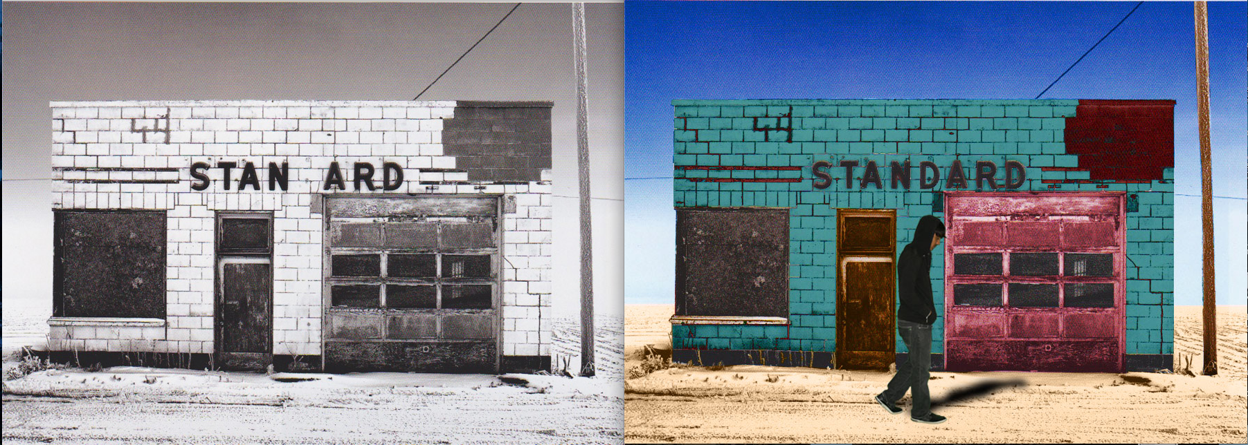
This was my final assignment in my Visual Communication class, in which we had to color a black & white picture and also insert a picture of a person in there. I used Photoshop to do the assignment and I think it turned out pretty good.
Final Assignment 2
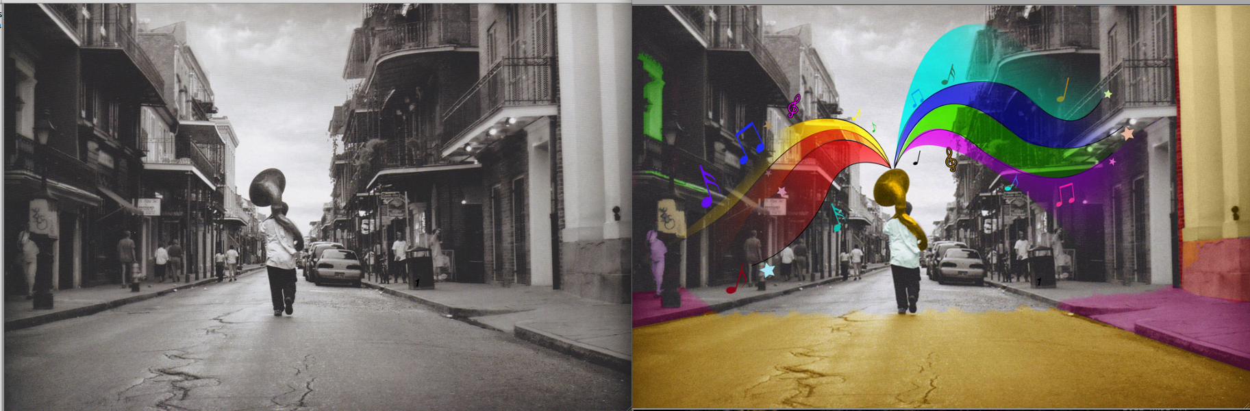
This was my second final assignment, in which we had to make designs coming out of the bell of the instrument in the picture. Bonus points were given to the students who colored some parts of the picture. I made a design of some colors coming out of the bell and coloring the street and the houses. I really liked the result.
